skip to main | skip to sidebar
Michelle Lee Interiors
  • contact
  • design boards
  • home tour
  • services
  • shop
  • home
  • Show all posts
Showing posts with label living room. Show all posts

Tuesday

Spring has Sprung...Sorta


At least it feels like Spring in mi casa!  I showed off my new storage shelves a couple weeks ago.  They  left a bit to be desired in the styling area.  Since we have our tv above the fireplace with all kinds of technology clutter surrounding it, I don't have a mantle to style for each season.  Why not style the top of this shelving appropriately and call it a day?!  So, here it is!  My spring shelf!
I mentioned it in my other post, but I got the faux window frame from Target.  It's actually a picture frame!  I already owned the pitcher (got it from JoAnns for cheap!) and stuck some $6 flowers in it from Sams Club!  Tip: create balance with your vignette by using an odd number of groupings of various heights.  Make sure to think about the colors of your items as well!  I made the wreath with a simple wreath form and a couple rolls of moss.  I tied it onto the frame with a simple piece of burlap.  The large metal letters came from Hobby Lobby.  I got them when they were 50% off so they were only $12 each!


DIYer-in-training!

There ya have it!  I love the pop of color it adds too!!

Anyone else compensating for the weather by bringing Spring inside??



**I'll be linking to these lovely ladies:
At the Picket Fence
The DIY Showoff
Serenity Now
The Shabby Nest
Shabby Creek Cottage
Just a Girl
Home Stories A to Z
Tatertots and Jello
Thrifty Decor Chick
The Lettered Cottage

Posted by Michelle @ Michelle Lee Interiors at Tuesday, May 07, 2013 1 comments
Email ThisBlogThis!Share to XShare to FacebookShare to Pinterest
Labels: bookshelf, bookshelf decor, dining room, diy projects, home accessories, kitchen, linking up to, living room, spring, storage, styling

Friday

For the Love of Storage

When we bought our house, we were young.  We were the bright eyed, about to be newlywed, living the American Dream kind of home buyers.  Oh yeah, and we were stupid.  Okay, not stupid per se.  But definitely had our blinders on.  Our home was a foreclosure, so we looked at the big picture rather than in the details.  But now, as our sink fills up with bottles and pacifiers, I'm realizing that we have a MAJOR lack of storage in this joint.  Enter the greatness that is IKEA and the Hemnes cabinet.

Of course, I had to make it my own.  I dug around in my paint collection and grabbed my peacock blue that I used on the desk in the office.  A few coats later, I placed all of our white dishes in the upper glass portion.  The drawers are stuffed with bottles and a sanitizer and extra pacifiers.  Finally, we've got room for it all.
I found a great window-looking frame at Target and my JoAnn's pitcher to stick up top.  I have a couple of things I want to add, but here it is for now!  Oh, and it blends perfectly with my wall-o-shelves!
Anyone else trying to find a home for pacis and breast pump parts?!  No?  Just me?  And because I'm a new mom and I just can't help myself...

This little love of my life is already 6 weeks old!  Feeling blessed these days!


Posted by Michelle @ Michelle Lee Interiors at Friday, April 26, 2013 1 comments
Email ThisBlogThis!Share to XShare to FacebookShare to Pinterest
Labels: bookshelf, bookshelf decor, kitchen, living room, storage

Coffee Table Styling

I've been moving some things around in the living room ever since my Christmas decorations came down.  I'm already in the mood for Spring and looking for a way to spruce up my coffee table.  I found some great coffee table styling inspiration and thought I'd share:
Pinned Image
I love the big pots that bring this large coffee table down to scale.

Pinned Image
A simple box for your remotes and things with a few simple, decorative items.

Pinned Image
1.  I love this rug.
2. The simple stacks on top with the fresh floral arrangement is on point.  Don't forget to style your bottom shelf too.  The basket, stack of magazines and starfish finish the look.

Pinned Image
Do you have a small coffee table?  Or maybe need more of a clean slate so you can use your table more?  This is perfect.  A basket for your magazines and a simple vase.  Lovely!

Pinned Image
This is one of my faves and probably the direction I'll head.  A couple low stacks of books with a large basket to keep all of your little things and hold a vase.  I would recommend a lower arrangement so you don't impede on the line of sight or in our case...the ability to watch TV.  Ha!

Pinned Image
First, I love the rope handles on that silver platter.  But the simplicity of a couple stacks of books and magazines topped with a tray is a clean, chic look!

Pinned Image
This is the perfect formula for styling success.  The tray holds a nice low vase and leaves room for some of those things that tend to float around on coffee tables.  I would place a bowl on top of one of the stacks of books for my jewelry (I tend to take it off as soon as I sit down) and enjoy.  Loving this arrangement!

Pinned Image
ALL PHOTOS CAN BE FOUND HERE

Another tray in place with a small plant.  But my favorite part of this table styling is the jar on top of the stack of books.  That would be a great place to stick seasonal items and change the look throughout the year.  Does anyone else just think it's a great looking table?

Anyone else having trouble styling that pesky little table in the center of your eating area?  Is your table styled to a T?  I'd love to see it!  I'll be working on my coffee table and hope to share it with you soon!!

Posted by Michelle @ Michelle Lee Interiors at Friday, January 20, 2012 0 comments
Email ThisBlogThis!Share to XShare to FacebookShare to Pinterest
Labels: coffee table, home accessories, living room

Thursday

Be Inspired: Rustic Elegant Living

Good Morning and Happy Thursday!  I've been feeling a little under the weather for the last few days so I apologize for my lack of posts this week.  I thought I'd share a beautiful picture with you to start your day!  Enjoy!
Pinned Image
VIA

I'm in serious lust for that coffee table on casters.  And I've never wanted to curl up on a leather couch as much as I do right now.  The addition of cozy throws and pillows transforms something that can often lean towards cold or masculine to very cozy and warm.  The small chandelier paired with pretty pink florals gives the space a feminine touch and softens the look.  Beautiful right?!

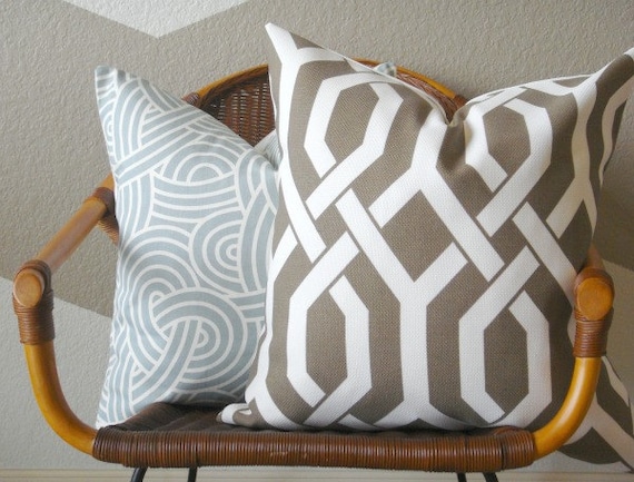
I also wanted to let y'all know NEW pillows hit The Shoppe this week!  So feel free to check them out!
P. Kaufmann 20" Slick Pillow Cover (Mink)

Only 10 shopping days left!  I still have to wrap everything but I finished up stocking-stuffers this week.  How is everyone else?  Did you finish early so you could sit back and enjoy the rest of the Holiday Season?

Posted by Michelle @ Michelle Lee Interiors at Thursday, December 15, 2011 0 comments
Email ThisBlogThis!Share to XShare to FacebookShare to Pinterest
Labels: be inspired, living room, pinterest, the shop

Wednesday

It's a Paaar-tay!

A Roomspiration blog hop & link party that is!  Today is all about the Living Room and ours is finally starting to come together!  We started with an anything but mellow yellow great room:

Two coats of paint, a rug, some furniture, a gallery wall + wall-o-shelves and one monstrous DIY project later:


While I L.O.V.E what we've done so far, I still have some pretty large items to purchase to get it lookin' good.  Like this tulip chair from West Elm that I've drooled over several times:


Aaand we need curtains (maybe like these)
Carved-Circles Window Panel

an ottoman (maybe like this)
Turned-Leg Dhurrie Ottoman

a pillow switcharoo (I'm already ready for some more pillow talk)...the list just goes on and on people.  So now it's your turn!  Give me some Roomspiration and head over to Kelly at View Along the Way to link up!
Posted by Michelle @ Michelle Lee Interiors at Wednesday, September 14, 2011 8 comments
Email ThisBlogThis!Share to XShare to FacebookShare to Pinterest
Labels: be inspired, linking up to, living room

Thursday

The DIY That Got the Best of Me.

Whew.  This was the project that I thought would never end, but was totally worth it.  That being said, I won't be making another one for a very, very long time.  But the beauty of me going through all the pain is that I can give you some tips and tricks that I learned along the way that will make this project much easier for you!  So let's get to it!  Here she is!  Our subway art that represents different places the Mr. and I have each lived (or just happened to be born) at some point in time during our 26 years on this lovely planet!


This all started with an empty corner.  I have plans on a little reading corner complete with a West Elm tulip chair, small side table and lamp.  But the wall had me stumped.  See it...to the right of the shelving?


So I ventured around the blogosphere and it didn't take me long to decide on a large piece of subway art.  But with the least expensive customized option around the $250 mark, I knew I was going to have to roll up my sleeves.  That's when I found a DIY distressed subway art at House of Smiths.  This was perfect for a few reasons. 

1. I needed a 4' x 2 1/2' piece of art .  I searched high and low (well, from Google to Bing) and I couldn't find stretched canvas that didn't break the bank, so plywood was a great option.

2. I have some other shabby chic items on my Wall-o-Shelves and Gallery Wall, so the distressed look would be a perfect fit.

3. How hard could it be?  Shelley made it look so easy-peasy!  This is something I should have taken some time to think over since she had a few items at her disposal that would have made this project much less of a headache (specifically the negative space vinyl stencil, gah, I wish I had one of those).

After absorbing a few tutorials, I had the confidence to get her started.

First, I  didn't have a fancy shmancy program to create my poster.  So I typed it up in Word and knew the size I needed my final project to be.  I gave the Kinkos girl my measurements and let her do her thang.  This is what I took home for $10 (I think I may have been able to get it cheaper somewhere else but I didn't shop around, darn it):

I attached my poster to contact paper using spray adhesive.


Then, I cut each address into strips so I could set up the layout.  It was pretty much in the order I had originally typed it, but I moved a few things around.  Make sure your large font lines are spread evenly throughout. 

I spent the next three nights catching up on Keeping Up With the Kardashians and cutting letters to my little heart's content.  Yep, I cut every single letter out.  I kept them organized with sandwich baggies and I labelled them with the address and the line number so I could keep them in order.  I nearly developed carpal tunnel syndrome, but no pain no gain.  Then, I was off to Lowe's where I picked up a sheet of plywood and had them cut it into a few 4' x 2 1/2' sheets.  I had a sliver leftover, so, yay for another DIY!  FYI, they cut it fo' free y'all.  Take advantage.  Once I got home, I got my sand on including rounding the edges a bit.

Tip:  I got a relatively raw plywood.  However, I suggest getting a smoother version that could eliminate a lot of the sanding as well as possibly help the letters stick better.  They didn't want to stick to my splintery wood.

I knew I wanted my art to be off white with black letters to match my wall-o-shelves.  So I spray painted my entire sheet black with a satin finish.


Remember when we laid out our strips for a layout mockup?  I spaced my lines 1 1/2" apart in order to make the layout reach my 4 ft. goal.  So I laid my words out one more time for letter spacing as well as to make sure the piece as a whole was evenly spaced and filled the entire sheet.  I drew a line to keep everything straight.
 

Time to stick!  I peeled the contact paper backing off and stuck each letter in it's place.  Then, I took a regular cheapo fine bristled brush and painted over the entire piece, using the letters as stencils.

Tip:  Be sure to clean your surface thoroughly before sticking.  Otherwise, you end up with runaway letters like you see below.  See how the letters aren't stuck to the wood surface.  pain. in. the. rear.
 

In the midst of my frustration, I looked over at Miss B enjoying her Dingo bone.  She gave me the "c'mon mom, you can do it" look and I was rejuvenated.  Time to press on.


After two, that's right TWO, coats of off-white paint, I was ready to reveal my letters.  I used tweezers on the ones that actually stuck like Shelley suggested.  Unfortunately, I had several that were not stuck and I just pulled those right up.


Since I was going for the distressed, a.k.a. not perfect, look, some of the bleeding paint on the letters just added to the piece.  I think it's a great addition to our living room and it makes the corner much less of an eyesore.


Time to break it down:
roll of contact paper     $4
Kinkos print                $10
Black spray paint        $4
Off white paint            FREE!  Already on-hand from My Big Fat Chevron Wall project
plywood                     $7

TOTAL $25!  Told ya it was worth it!

I'll be linking up to these great parties:
The DIY Showoff
At the Picket Fence
Serenity Now
The Shabby Nest
Shabby Creek Cottage
Just a Girl
Thrifty Decor Chick
Home Stories A to Z
Tatertots and Jello
The Lettered Cottage
Posted by Michelle @ Michelle Lee Interiors at Thursday, August 25, 2011 18 comments
Email ThisBlogThis!Share to XShare to FacebookShare to Pinterest
Labels: diy projects, get the look for less, linking up to, living room

Monday

Wall-o-Shelves and Gallery Wall. Check.

The project started just three short months ago with this living room inspiration board that I dreamed up.  Then, I showed you my gallery wall inspirations along with some wall-o-shelves inspiration!  After an hour afternoon trip to IKEA, some bargain shopping at garage sales, and a handful of coupons at Gordman's and Hobby Lobby, we went from this:
BEFORE
To this:

AFTER
I apparently got a little camera happy trying to get every possible angle for the after shots.  So there are A. Lot. of pictures.  Enjoy!
Here's some of our stuff:
I'm in lurve with these linen boxes and magazine holders from IKEA!  They were a splurge since I had intended to go with the supa-cheap cardboard option before I saw these bad boys.  It was yet another way to add texture, forever storage (because we will be keeping these puppies for foreva!), and kept in theme with my mix and match of stark white with cream!
And now for some closeups of our gallery wall.  I showed you the process of putting this bad boy together here and here!  And don't forget my easy-peasy frame filling DIY projects (like my "pick your battles" poster and chair silhouette)!
And some more of our stuff:

Miss B wanted to get in on the action.  What a great little helper!
 
Okay, she's actually staring intently at a toy she just placed in my lap.  Anywho, there she is.  My l-oong project that was well worth the time, money, and I would say patience but the Mr. would beg to differ.  I'm still on the hunt for the perfect chair and end table for the corner to the right of the shelves.  One thing at a time.  In any case, the project is checked off of my mile long "to do" list and I couldn't be more excited!  Still a couple of tweaks to finish up (painting the rhino and dark chess pieces white) but no project is ever really finished anyways.  Right?

Posted by Michelle @ Michelle Lee Interiors at Monday, July 18, 2011 34 comments
Email ThisBlogThis!Share to XShare to FacebookShare to Pinterest
Labels: before and after, bookshelf, bookshelf decor, diy projects, Gallery Wall, gallery wall frames, home accessories, living room, storage
Older Posts Home
Subscribe to: Posts (Atom)

Meet Michelle

Meet Michelle
I'm a newlywed and Interior Decorator with a passion for coffee, shopping, and creating styled interiors for every budget. Contact me for more information at michelleleeinteriors@gmail.com.

INSTAGRAM

Shutterfly.com

THE SHOPPE

THE SHOPPE


Google Friend Connect

  • At The Picket Fence
  • Home Stories A to Z
  • Johnny In A Dress
  • Serenity Now-A Mommy's Solution to Staying Sane
  • 6th Street Design School
  • 7th House on the Left
  • ::: FOCAL POINT :::
  • abode love: a man's home is his wife's castle
  • Adventures in Decorating
  • Amber Interior Design
  • Arianna Belle
  • Arkansas Home Design Blog
  • Blog
  • Bower Power
  • bryn alexandra
  • Caitlin Creer Interiors
  • caitlin wilson design: style files
  • Centsational Girl
  • danielle oakey interiors
  • decor8
  • design dump
  • Design Evolution
  • Design Manifest
  • designsponge.com
  • Emily A. Clark
  • Gad•ding•Gal
  • Home Stories A to Z
  • House of Smith's
  • House*Tweaking
  • Just a Touch of Gray
  • Life in the Fun Lane
  • Live the Home Life
  • Living With Lindsay
  • MadeByGirl
  • Making it Lovely
  • modern jane
  • PW FULL RSS FEED
  • sadie + stella
  • Serenity Now-A Mommy's Solution to Staying Sane
  • SUSPENDED
  • Tatertots and Jello
  • Ten June
  • The DIY Show Off
  • The Lettered Cottage
  • The Mustard Ceiling
  • Third Floor Design Studio
  • Thrifty Decor Chick
Related Posts Plugin for WordPress, Blogger...

Grab my button!

summershoots
a month in re-view a year in re-view accent chair all about me area rugs bathroom be inspired bedroom before and after birthday blog luvin' bookshelf bookshelf decor chicken coffee table color combinations craigslist dining room diy projects dresser entertaining entryway etsy fall family fashion furniture Gallery Wall gallery wall frames garage sale get the look for less giveaway gray holidays home accessories house tour instagram key keeper kitchen lighting linking up to living room mason jars master bedroom mid century modern momma must-haves monthly pics moodboard nursery office/craft room offices organization our little family outdoor living paint pinterest pretty little things roundup salad sewing shopping spring storage styling summertime textiles the shop things i heart throw pillows trash to treasure vases what's for dessert what's for dinner yellow
 

the shoppe!